Journal
Designing a Branded Space: 5 Things to Consider
Interior branding is a complex process that goes way beyond signage. Every brand has a story to tell. And it is the architects who have to translate this story into a physical environment. But, even before that, they need to learn every bit of it. And the learning part is as important as the design itself.
Getting started: study the brand
As we discussed in the previous article, every brand is a combination of visual and experiential elements. It often happens that visual elements, such as graphics and colours, are easier to capture and, as a result, they take the central spot in a branded space. But, the essence of the brand is often intangible. To get to it, you need to puzzle the company’s heritage, its values, culture and vision into one picture. Only when it’s complete, you can look for the ways to express it with the visual language and tangible elements. So, even if you decide to create signage or use a logo, these interventions into space will be well thought-through. And, together with the other elements, they will tell an immersive story of the brand behind it.
The tricky part is not getting trapped in surface-level measures. When you don’t dig deeper into the brand identity, you’ll probably end up repeating yourself. A logo here, a graphic there. Although there’s nothing wrong with using a logo, let’s consider some other ideas that will make a brand stand out without shouting its name.
#1. Consider the local background
Every space is shaped by the environment surrounding it. If you look at international companies, you can notice that their premises differ among countries; even though the brand identity is the same. A link to the local background adds a sense of belonging and connection. And it’s definitely something you should consider when building a branded interior.

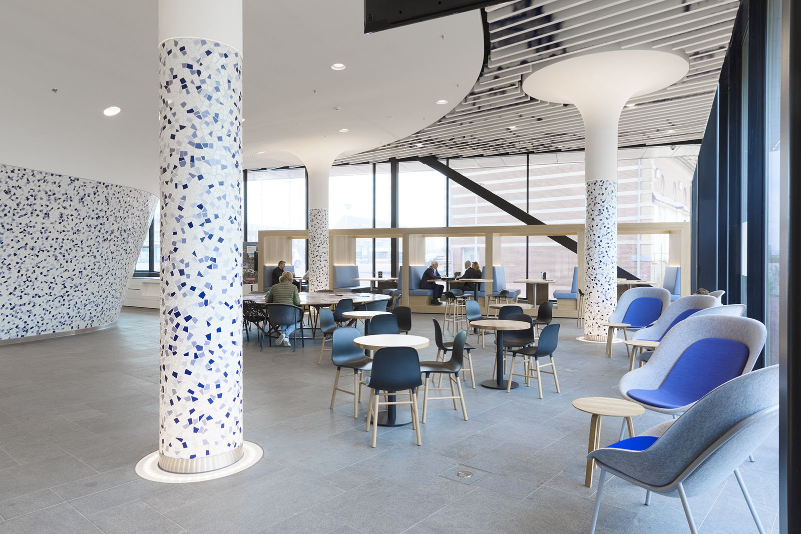
When designing the new city hall in Delft, Studio Biek wanted to link the interior to the rich cultural heritage of this area. Inspired by the works of Johannes Vermeer, a famous painter from Delft, they chose blue and ocher as the accent colours. Also, during the construction of the city office, archaeologists found interesting objects in the soil. These "Treasures of Delft" are now showcased in the corridors and throughout the working environments. Thus, the history of the city became part of this interior design.
#2. Look for the heritage
Many well-established brands have strong physical and material heritage. If that’s the case, you can respond to it in the interior design. At the same time, many service-based companies don’t have a physical product. But their heritage might be a distinctive graphic style, that you can also consider as a branding element.

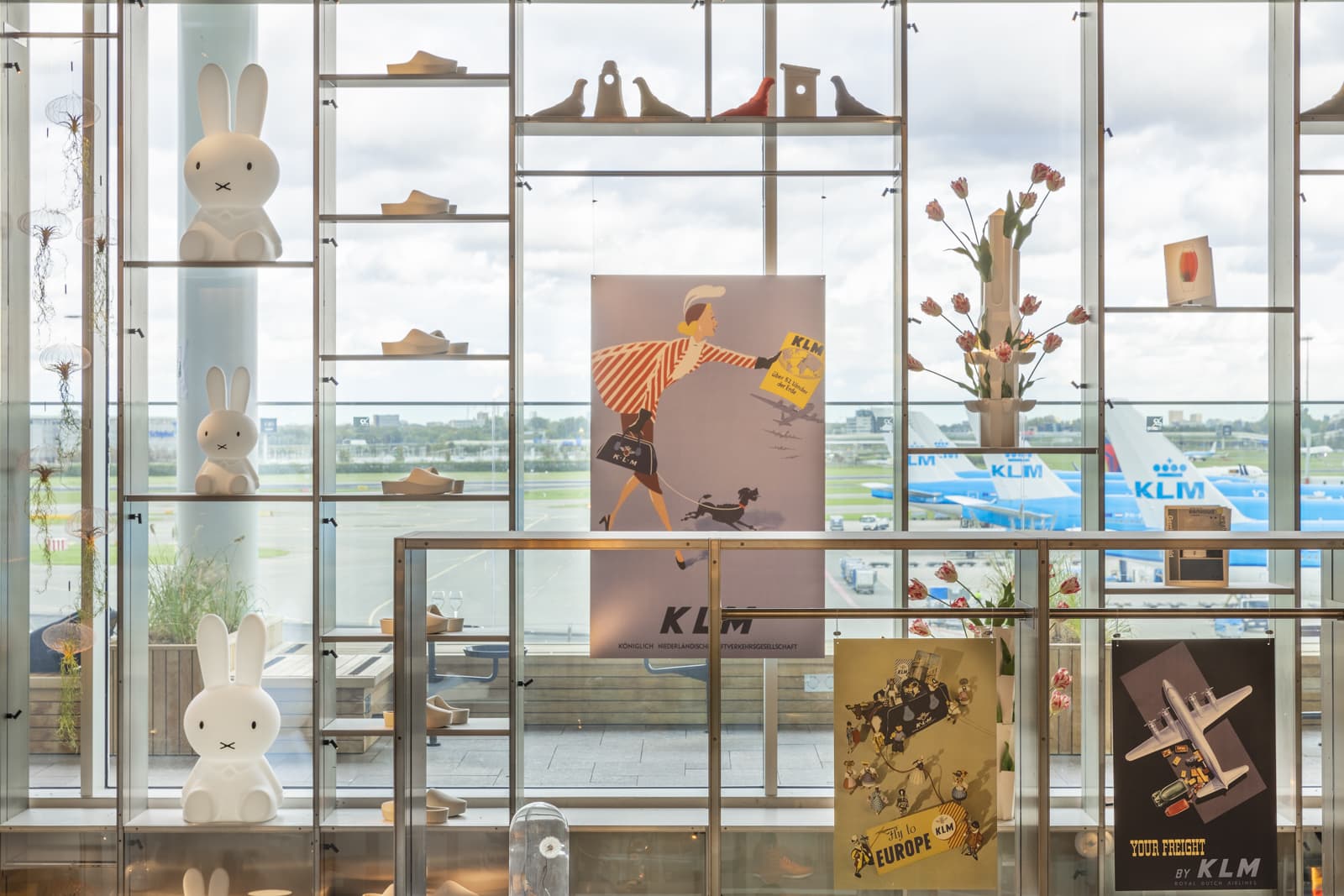
To add branding elements to the KLM Crown Lounge in Schiphol, concrete resorted to the company archives. They found a lot of vintage posters, uniforms and old suitcases that were eventually used in interior design. The architects also used the iconic pieces of the Dutch culture, like Nijntje and clogs, to pay homage to the airline origins.
#3. Make a link to the core value
Every company has its values, that can and should be shared in interior design. In fact, you can use a core value as the anchor and build the whole interior around it. Maybe, your client wants to let people know that they care about the environment? Then, you should make their interior as sustainable as possible. If you design for an innovative start-up, the last thing you should do is put them into a boring traditional office. So, before starting with design, learn what the company cares about. It will give you plenty of hints about the future direction.

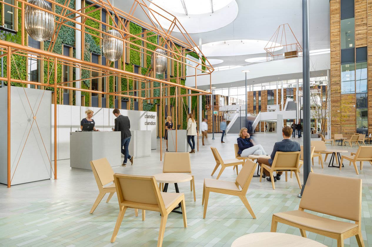
For Liander, sustainability is paramount. With that in mind, RAU and Fokkema & Partners made this value central in the interior of their new facility. And the result is stunning - over 80% of the used materials were recycled and reused. This renovation project made Liander Duiven the first circular building of this scale in Europe.
#4. Engage all the senses
It often happens that interior design is all about how things look. But, visual language is only one of the six tools you can use. As Sissel Tolaas puts it in our Pod Session:
“We have the hardware, called the body, and we have five amazing pieces of software called the senses. And I think we need to create environments where all of these senses are challenged somehow. Environments are primarily driven by visual qualities. That’s not enough, not at all.”
There lies the challenge for architects - to incorporate all the senses when designing the next space. But among all of them, the smell seems to be the last frontier in architecture. An exciting one. Because people only notice smells when it’s bad or good. But everything smells and that is an interesting concept to play with.
“If you enter a hospital, you get sick just from the smell of it. I think it’s a very underestimated variable knowing that kids have the most developed senses. You’re born with amazing alert senses and it seems that nobody cares. The acoustic is lousy, the smell is disgusting. The light is, oh my god! And if we just improve that a little bit, the outcome would be radical.”
#5. Create a custom solution
At some point, every interior design project comes down to the choice of materials and products. And when making these choices, you will surely want to underline the unique character of every brand. But finding never-used-before solutions for every project might be hard, if not impossible. Here, it might be interesting to consider custom-made items. Learn more about the benefits and possibilities of custom furniture in our next article.


.jpg?width=487&name=Square_duotile_De%20Vorm%20AK%20Soft%20Distancing%20originator%20(1).jpg)
