Journal
3 Architects On How They Translate Brands Into Interiors
In the quest to make spaces experienceable, these architects treat interior branding as an absolute must.
In this interview, Kim le Roux (LXSY Architekten), Raquel Machado (M Moser Associates) and Rick Rijkse (Fokkema & Partners) tell how they translate powerful brands into equally powerful interiors.
How to make a brand experienceable in a physical space?
RM: Reflecting a brand in the interior is intrinsic to the impact of a space and a vital part of the design development. It should never be an add-on. It’s a careful and thorough process, and if you’re working with a defined brand identity, it’s evident. Every client has a unique brand story, so there is no one-size-fits-all approach. It’s a creative exploration to align the brand message, values and story, with culture, ways of working and space types.
A well-designed brand journey should create a carefully woven expression of the brand while shaping the desired behaviours. A media business might want to encourage playful, creative, explorative values, exemplified in a range of finishes, textures and “surprises” in the design. However, a law firm may prioritise transparency, quality and confidence, manifesting in solid materials and minimal textures.
“Reflecting a brand in interiors is intrinsic to the impact of a space and a vital part of the design development. It should never be an add-on.”
KLR: Branded environments reflect the personality and vision of a company within the physical environment. Materials and colours are very important in shaping these spaces. Hard materials and dark colours versus soft materials and light colours send very different messages. Therefore, defining the message you want to communicate is essential to the physical experience of a brand.
We start our projects by understanding:
(1) the company culture
(2) people working there as well as the people visiting
(3) the product itself.
By establishing a list of requirements for all three groups, we get a comprehensive picture of a brand, people producing it and people consuming it. Company culture is also crucial here - it creates a unique atmosphere, associated with a given brand. Our task is to translate the requirements and the culture into tangible elements so that one could experience the brand in a physical space.
A powerful brand sets a certain framework for interior design. What about those who don't have that strong brand identity?
RR: It’s true that well-established firms will often provide you with a brand book explaining everything to the smallest detail. Not only does it cover their products and retail spaces, but it also explains how their workplace should look like. In this case, you have a rock-solid foundation to develop an interior on. Powerful brands can communicate so much using only the logo - you cannot neglect this fact.
However, when you work with big players, it might be challenging to think outside the box. Their brand identity has been built for years and it is quite risky to deviate from it. These companies know exactly what they expect from the interior. That’s why working with new brands is so exciting. It’s true that their brand identity might not be established yet. And yet, it’s quite interesting to investigate such brands - it gives you much more freedom in interior design.
“Big brands can communicate so much using only the logo -
you cannot neglect this fact.”
What’s the most challenging about interior branding?
KLR: I believe the challenging part is getting to understand and experience a brand the way our client does. To achieve that, we explore all processes happening within a company. If we can map these processes accurately in the physical environment, beautiful serendipitous moments will happen there. For example, a spontaneous encounter of two colleagues, who eventually come up with a good idea. It usually happens during a coffee break in the kitchen, but how many other moments like that can one create in a space?
RR: Sometimes, it’s getting hard to keep the branded spaces unique and exciting. When you begin the new project, the first things that come to mind are often visual - a logo, a certain product or brand colours. There’s nothing wrong with incorporating these elements into the interior. However, if you keep using them and only them in every project, at some point you’ll start repeating yourself. When done right, interior branding adds something extra to these “basic” elements. As a result, it never gets boring.
How do you add this “extra”?
RM: The brand journey is key. Designing to enable clients and visitors to understand the brand, and employees to feel a part of it, can connect people to purpose, building engagement on a deeper level.
Beginning from the entrance, people should experience the brand and be guided by it. Reception design is a great example of how space can bring brand purpose to life, creating a lasting first impression. Does it feel formal or collaborative? What textures and materials support the journey that plays out through space?
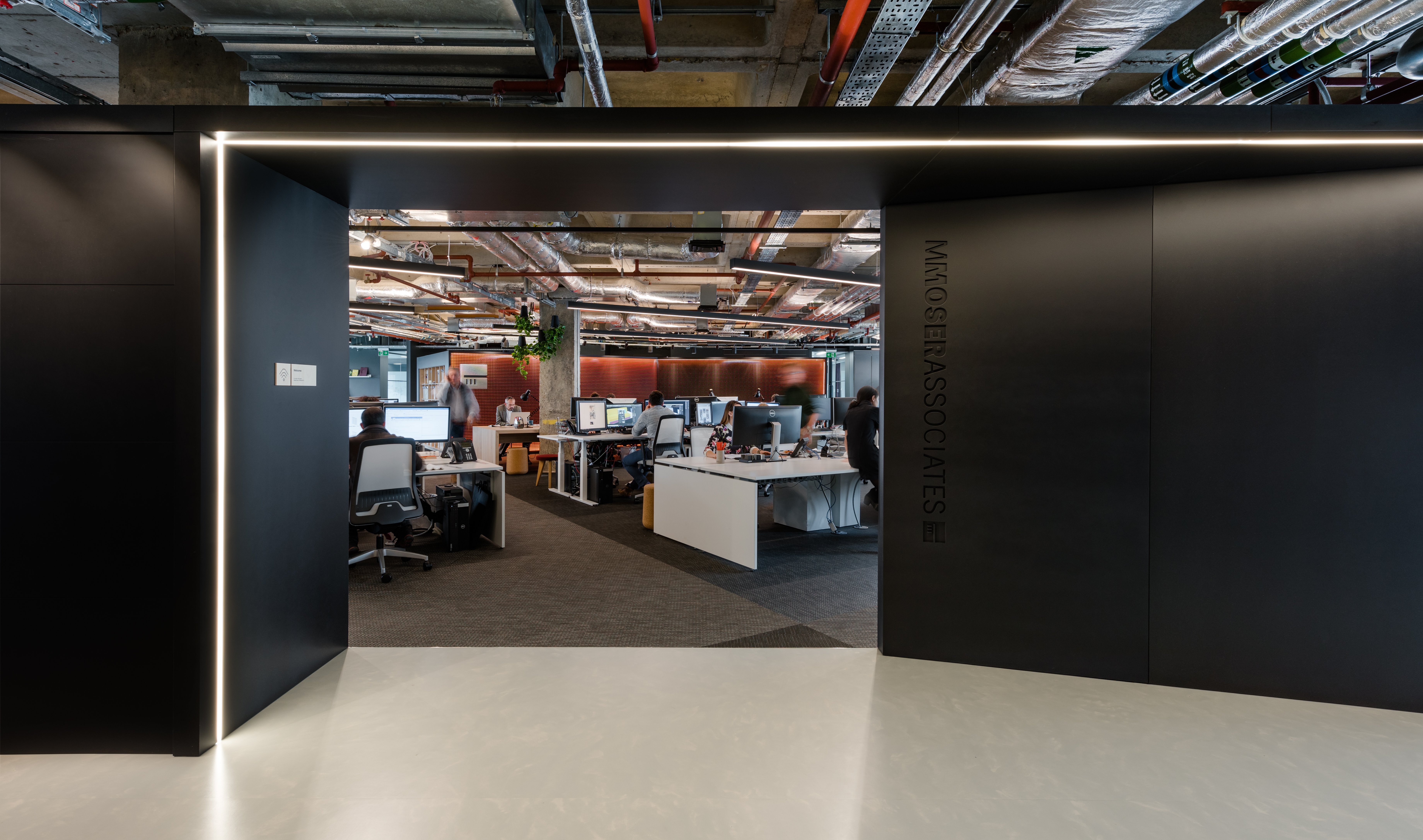
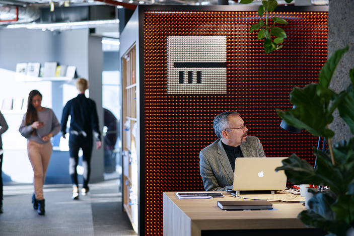
In our London office, we have a striking feature wall made up of over 20,000 pencils. It’s the branded centrepiece of the space, but it doesn’t define the brand alone. It needs to be experienced alongside other aspects of the space; an open reception encouraging collaboration and community views through the office emphasising transparency, connectivity and more. The brand story looks beyond graphics to every aspect of the design, supporting teamwork and inspiring creative thinking.
What's the role of a brand in office design? And how does it influence the choices you make?
KLR: Brand has a central role to play in every interior design - the workplace is no exception. Even if a company says the office has nothing to do with their brand, anyone visiting will make that association. That’s why every workplace should represent a brand behind it.
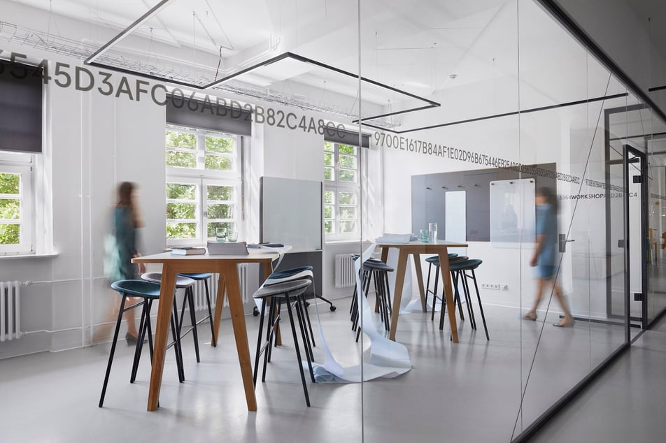
A good example here would be our work for FULL NODE, Europe’s largest co-working space for web 3.0 technology. Along with creating a high-quality work environment, we also wanted to communicate the mission and values of this space in the interior. Thus, we took the notion of collaboration and reflected it in the theme of bands and chains extended to the inscriptions on the inside glass walls. The blockchain code is visible throughout the room, creating a signposting effect. The sequence of open and closed spaces is emphasised by the interlinking chain effect, creating coherent spaces that can accommodate a variety of new working scenarios.
“Even if a company says the office has nothing to do with their brand, anyone visiting will make that association.”
RR: In many cases, customers have a very clear idea of what they want to get in their future office. Usually, it’s about the basics - they know how their workstations should look like, which common spaces they want to have and so on. From our side, we always strive to deliver something extra - something they don’t expect. By doing so, we want to evoke a strong emotional response and make the brand recognisable in an interior.
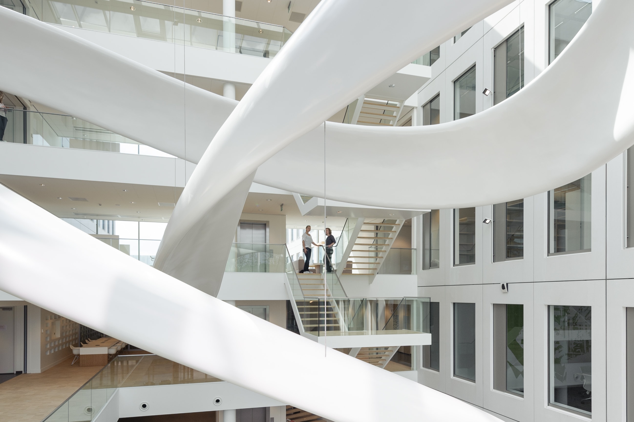
A vivid example of that is our work for FrieslandCampina Innovation Centre in Wageningen. To portray the fascination for milk shared by all researchers, we’ve designed Milk Splash. A white fluid shape originates in the reception desk and swirls itself three stories up into the air. It then descends towards the Experience Centre on the first floor and ultimately flows into a stair, leading it back to the ground floor.
As an architect, you probably don’t get a request for something like that in a briefing. And yet, our client loved the idea of representing the innovative strength of FrieslandCampina in such a unique and outspoken way.
What is the role of company culture in designing a workplace?
RM: Company culture is everything. It informs the unique design of each space – does the client need more collaboration zones or one-to-one focus areas? Is lunchtime socialising important? It does define every decision you make.
When we understand, in detail, the collective company culture, it is valuable to refine the approach by exploring dominant subcultures to support each team. A sales team will have a very different culture to an IT team, and this has an impact on their needs within the space. Subcultures can also exist within individual teams, for example, a product team might include both physical and digital product functions. The needs of these two groups are vastly different - from showcase spaces and interaction to quiet, “deep”, technology-focused work. The overarching culture will be most present when you have made impactful design decisions to nurture all subcultures.
Get more tips and ideas for designing branded spaces in our next article.


.jpg?width=487&name=Square_duotile_De%20Vorm%20AK%20Soft%20Distancing%20originator%20(1).jpg)
