Journal
Better Light, Better Work: How to Light Your Office For Productivity
Determined to create meaningful spaces, Sabine De Schutter believes that light is more than just an add-on to the interior design.
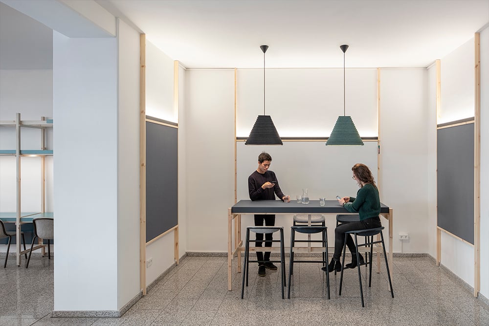
Studio De Schutter proves that light can shape environments, experiences and emotions. In this interview, the founder of the studio Sabine De Schutter elaborates on her approach to office lighting and shares some of the hacks for a healthier and more productive workplace.
As the days are getting shorter, people often feel the lack of natural light. Can artificial lighting help with it?
SdS: Indeed, there is a direct link between light and human health. Our biological clock and thus our sleep-wake cycle is regulated via the light intake through our eyes. That is why the lack of light during certain times of the year can have negative effects on our physical and mental condition, the so-called Seasonal Affective Disorder (SAD). It causes depression, sleeping problems and lack of energy.
While the amount of natural light we can get during winter is considerably lower than in the summertime, this effect is also aggravated by lack of illumination indoors. We wake up in the darkness, travel in the subway and spend most of our day in the office. This is why proper workplace lighting can go a long way in improving our well-being and performance - especially in the wintertime.
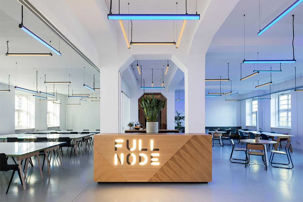 What are the key factors determining the quality of workplace lighting?
SdS: First of all, the amount of light or the so-called illuminance (lx). The standard for a working area is 500 lux, which is enough to work however, often insufficient for our circadian rhythm. Just imagine that direct sunlight varies from 32,000 to 100,000 lux. If the maximum we get during the day is 500 lux, our bodies will simply feel the lack of light. There are a number of studies indicating that an increase of illumination to 1000 lux and changeable light temperature between 6000K during the morning and 3000K with a lower illumination just before going home reduces stress and provides an energising effect. That could be a good option for workplace lighting as well.
Secondly, I would pay attention to glare. Lighting that glares is a common problem in workplaces, especially those using lots of decorative lighting. Most of these decorative luminaires don’t comply with office lighting standards and are blinding, disturbing or they reflect too much from computer screens, whiteboards, etc. This can cause headache and eye fatigue . For the luminaire to be classified as “low glare” in an office setting, it must have a UGR (Unified Glare Rating) of 19 or lower.
The third important factor is flicker, a rapid and repeated change in brightness of the light source. At a certain frequency, people can no longer distinguish the flicker, yet they are still affected by it. The common complaints related to flicker include headache, eye strain and visual discomfort. Flicker can be particularly disturbing in the conference rooms - as a camera might reveal the flicker quicker than a human eye, the image during video calls can be distorted.
As a lighting architect, you were involved in many office projects as well. Could you name some of the common mistakes to avoid?
SdS: Oftentimes, lighting becomes an afterthought of the workplace design. It is either planned too late or with little consideration. In my opinion, that’s the biggest, yet the most common mistake I come across. Lighting architects are often involved to fix the problem when the project is already finished. However, in this case, we are talking about redesigning from frustration from the client. The interior is already finished, the client has already spent money on lighting but it doesn’t work well and the lighting designer has to balance between all these issues. In order to avoid these costly and frustrating mistakes , it is better to consider lighting from the very first stages of the design process. This way, space will feel like a fully-designed concept, where interior design, branding, and light benefit each other.
Another common mistake is the lack of balance between functional and decorative lighting. In many offices, lighting is either standard and almost boring or too decorative and not fit for purpose. I believe that the truth is somewhere in between. We need functional lighting to make sure space is sufficiently lit and suitable for the task - be it focused work, video calling or something else. At the same time, we want to create a certain atmosphere by adding identity to space. That’s where decorative lighting comes in handy.
So, how do you find this balance between decorative and functional in lighting design?
SdS: We usually work in layers - the trick is to use at least two layers of light in one space. Direct and indirect light, spotlights and diffuse sources, horizontal and vertical illuminance - you can play with all these variables to find the optimal formula. There’s no golden rule here, as every space is individual. For instance, in a room with dark walls and a low ceiling, wall washers would be a good choice to increase the perceived brightness and height of the room, but they might be excessive in a light room with white walls. Therefore, lighting design needs a holistic, task-related approach that answers the following questions:
- - What’s the purpose of the space?
- Which areas do you want to illuminate?
- What is the desired level of illuminance?
- Where’s the user sitting?
- What is the user looking at?
- What are the reflection values they are exposed to?
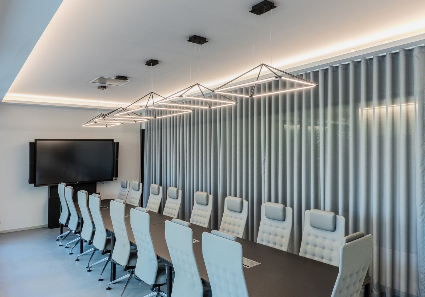
For one of our latest projects, we were asked to design a custom-made luminaire for the conference room. It was meant as a statement piece, so the aesthetic part of the design was crucial in this case. We created a custom-made fixture consisting of many cubical forms, that combine into a complete landscape. However, we also took the functional part of it into account. Since the fixture was installed over the table, we determined the horizontal illuminance on the desktop that we wanted to achieve. Also, we chose a microprismatic diffuser that will minimise the glare. Lastly, since we always try to have at least two light components in one space, we’ve also added some downlights around the perimeter. They don’t stand out so much and greatly help with the contrast between the table and the floor, as well as vertical illuminance on the walls.
What are the latest trends in workplace lighting and how you respond to them?
SdS: One of the major trends that we are currently evidencing is a shift from mainly task-related to space-related lighting. This has to do with the new social distancing rules in the workplace, requiring flexible and easily adjustable spaces. However, if an office layout is constantly changing, it also requires flexible lighting. So, there’s an increasing demand for such solutions coming from our clients.
Another growing trend is appropriate lighting for video-calls and dedicated video conferencing spaces. With more people working from home, video calling became a common mode of communication. At the same time, it revealed that many conference rooms are not fit for video calling. Flickering is a common issue, the light is either insufficient or almost blinding. In fact, lighting regulations for conference room illumination is somehow contradicting - on one hand, you want to keep the faces well and evenly-lit for the camera, but on another hand, you don’t want to blind people with direct lighting. So, we get more requests for Skype booths and meeting rooms with dedicated video-call lighting.
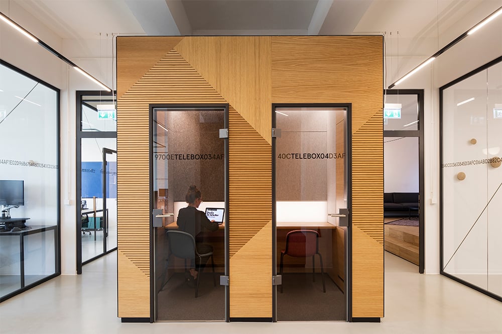
Your 5 lighting hacks for a healthier and more productive workplace.
SdS: There is hardly any other medium affecting our bodies and minds so much as light does. That’s why adequate lighting should be a primary consideration in office design. Even though the needs vary per space and user, there are some lighting tips that will help you increase overall well-being in the office:
1. Make artificial lighting the extension of the daylight
Instead of having the same standard lighting all day long and all year round, try adjusting it to the daytime and season, e.g by dimming or switching different lighting layers on and off. This way, it will feel more natural to people.
2. Create atmosphere with varying light temperature
You can make a breakout area feel warm and cosy by choosing warmer light (2700K). At the same time, the workstation will need a colder light to keep people alert and focused, 3000K and higher.
3. Take care of transitions
Avoid drastic contrasts in the light levels. For instance, if you go for 100lx in corridors and 500lx or more in offices, the hallway will feel dark. These transition spaces shouldn’t be neglected, especially in open-plan offices, as it’s where many spontaneous meetings happen.
4. Add vertical illumination
Illuminate the walls to improve the perceived brightness of the space. It will give a visual resting point for the eyes and make the room feel more spacious. Vertical illuminance will also reduce the contrast to the bright computer screens, and thus create an ergonomic lighting setting.
5. Consider dimmable solutions
Dimmable light is great for multi-functionality. For instance, if you hold a late-night event in your office, you can easily tone the light down. Dimmable solutions are also more efficient in terms of energy saving. Dim to warm light or click dim sources could be good here.
About Studio De Schutter
Studio De Schutter is a Berlin-based architectural lighting studio founded in 2015 by Belgian-born Sabine De Schutter. Studio De Schutter has taken on a variety of projects, ranging from creative lighting for technology start-ups to co-working environments and public spaces, always keeping people at the core of what they do.
