Journal

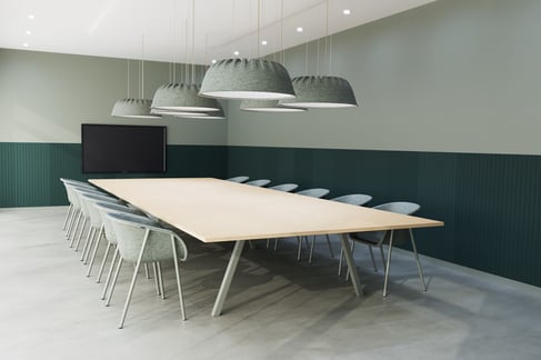
Monochromatic colour zones
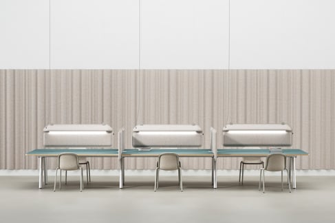
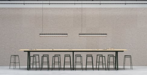
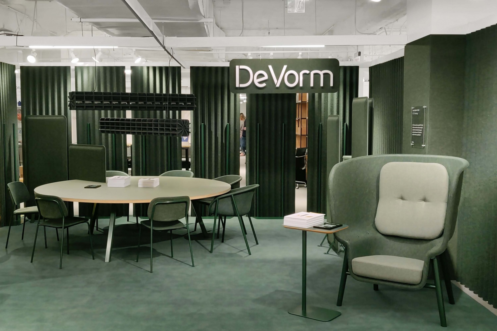
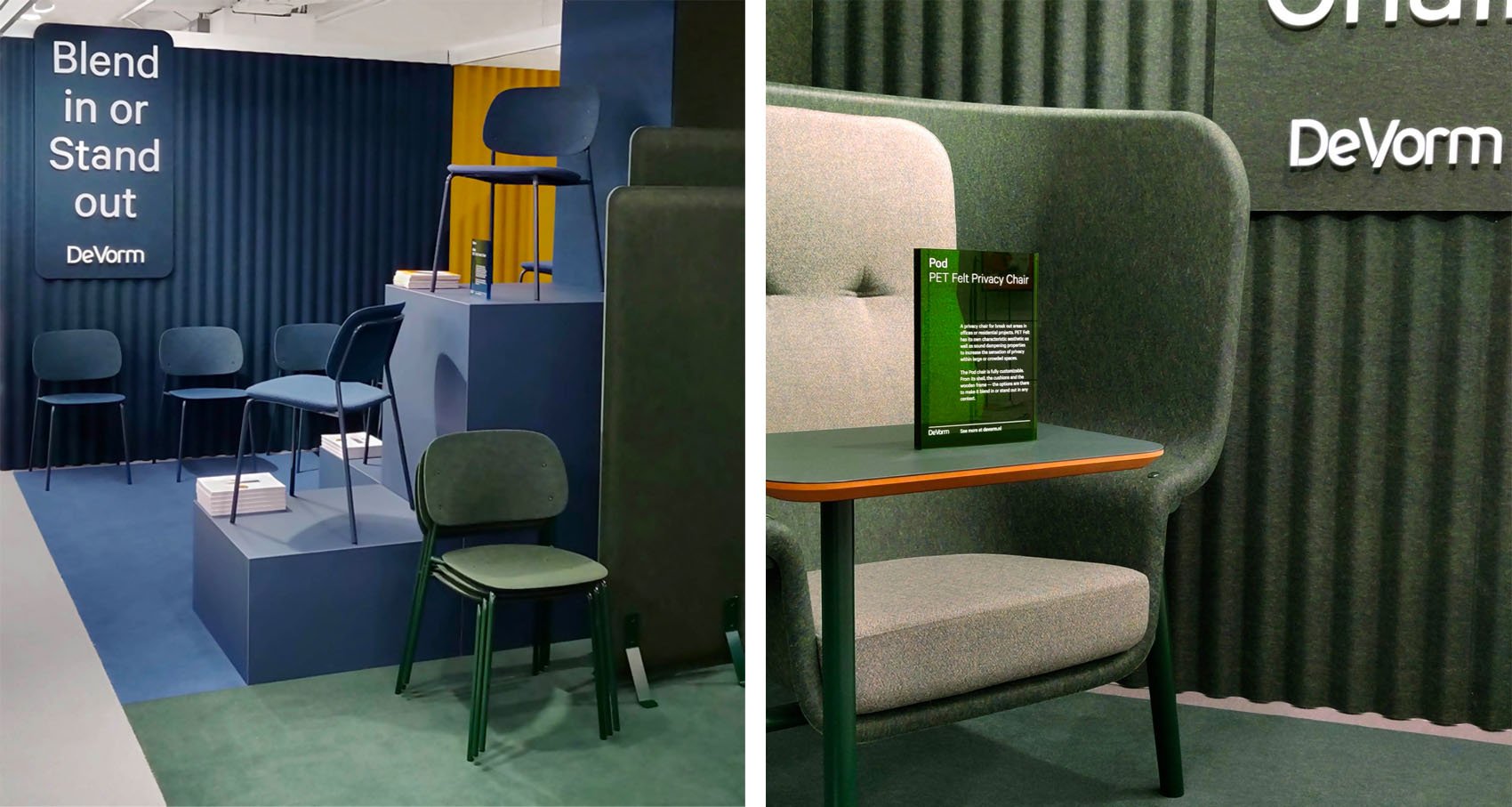
This NeoCon we emphasize the ton-sur-ton possibilities by using our pallet of unique PET Felt colour blends. Monochromatic colours and consistency were the basis of the design. Our booth was divided into three uniform and closed colour zones: blue, yellow and green. With the result that the visitors get absorbed by one colour.
PET Felt collection
By creating a mini-tour for the visitors, we were able to present our designs in several settings. Providing tactility, pleasant acoustic absorption and colour experience.
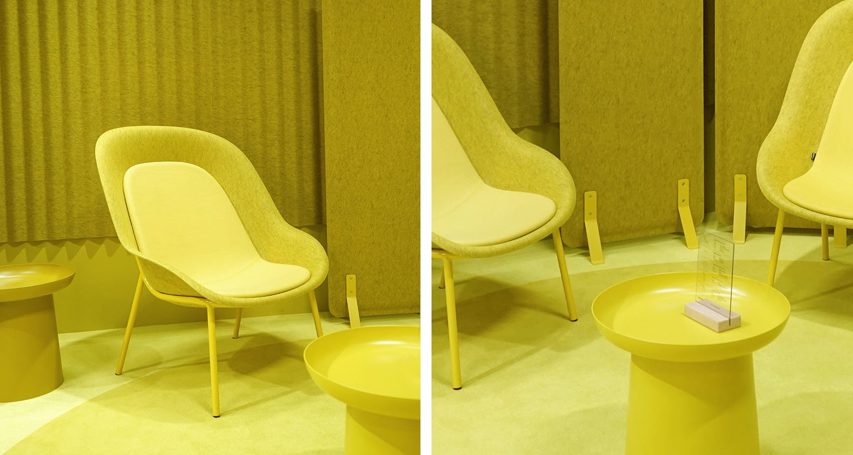
Yellow zone
Traditionally yellow is only used as an accent. However, we applied it throughout the entire zone to create a bright and vibrant statement. This cheerful colour turned out to be the most beloved colour – it definitely stood out!