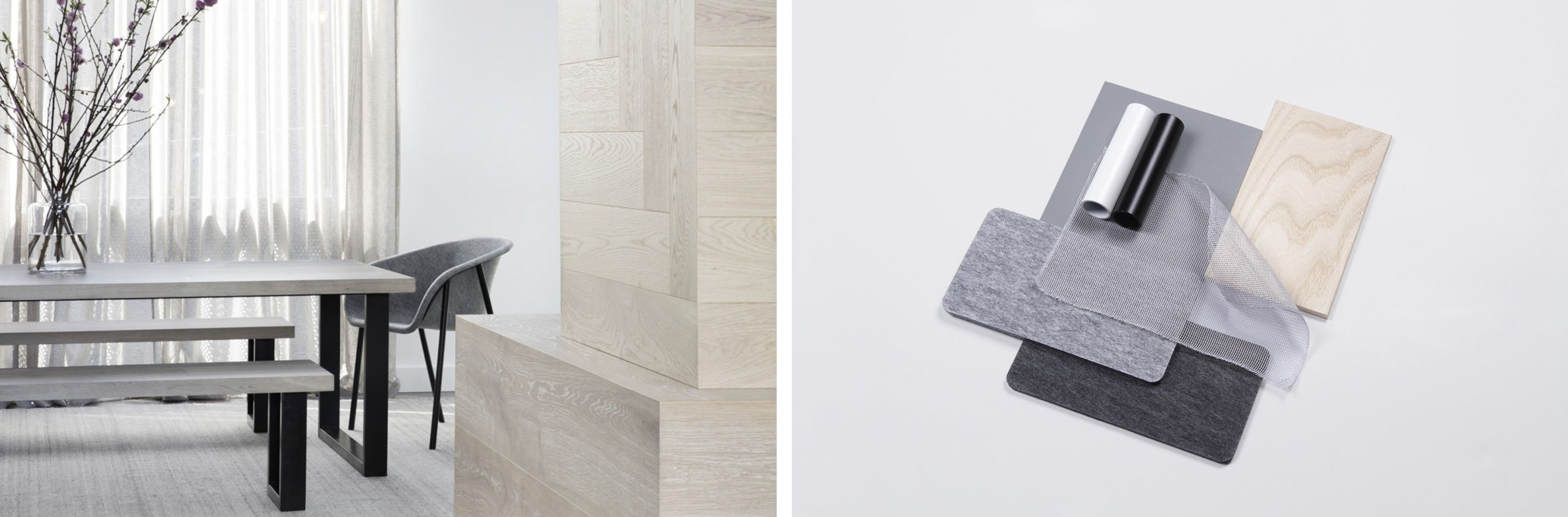
Journal
Being the fundamental and most expressive element of design, the impact of colour can hardly be overestimated. No wonder it continually provokes discussions and brings surprising (at times even contradicting) conclusions. But one thing’s for sure — colours influence peoples’ mood and overall well-being. Which is why, when it comes to a workplace fit-out, designers and architects approach this issue with great consideration.
The colours of office design
The visual representation of an office can be a tall order, as it goes far beyond “green is calming” and “yellow is energizing.'' Our perception of colours depends on many factors, such as hues, tints, tones and shades as well as how they work together.
 Moreover, people may respond differently to the same visual stimuli depending on their mood, physical state and personal preferences formed over time. Designing the office to suit the majority of preferences is therefore particularly challenging. Often the focus comes down to the original purpose of the given space — should it encourage teamwork, ensure concentration or make people feel relaxed? The colour choice will vary in each case.
There simply is no rule of thumb. But is “it depends” the only answer to this never-ending polemic? We didn’t want to leave you with just that, so we dug a bit deeper to find some colour use insights for workplace design.
Colour science
The pioneering stages of colour theory are generally associated with Carl Jung. He based his studies on the work of Hippocrates, who interpreted colours as a special elementary language. Jung extended this into using colours as a tool for influencing peoples’ mood and mental state through the use of visual images. Today, his approach is commonly known as art therapy.
'Colour is the mother tongue of the subconscious'
Carl Jung
The renowned benchmark in the field — Color Affects System — belongs to the British researcher Angela Wright. After years of studying colours and the psychological effects thereof, she presented the world with a comprehensive theory of correlations between colour families and personality types. Wright’s findings are used in the design industry to date.
So, what is the impact of colours in the workplace? There is only one way to find out — by turning to science.
So many men, so many minds
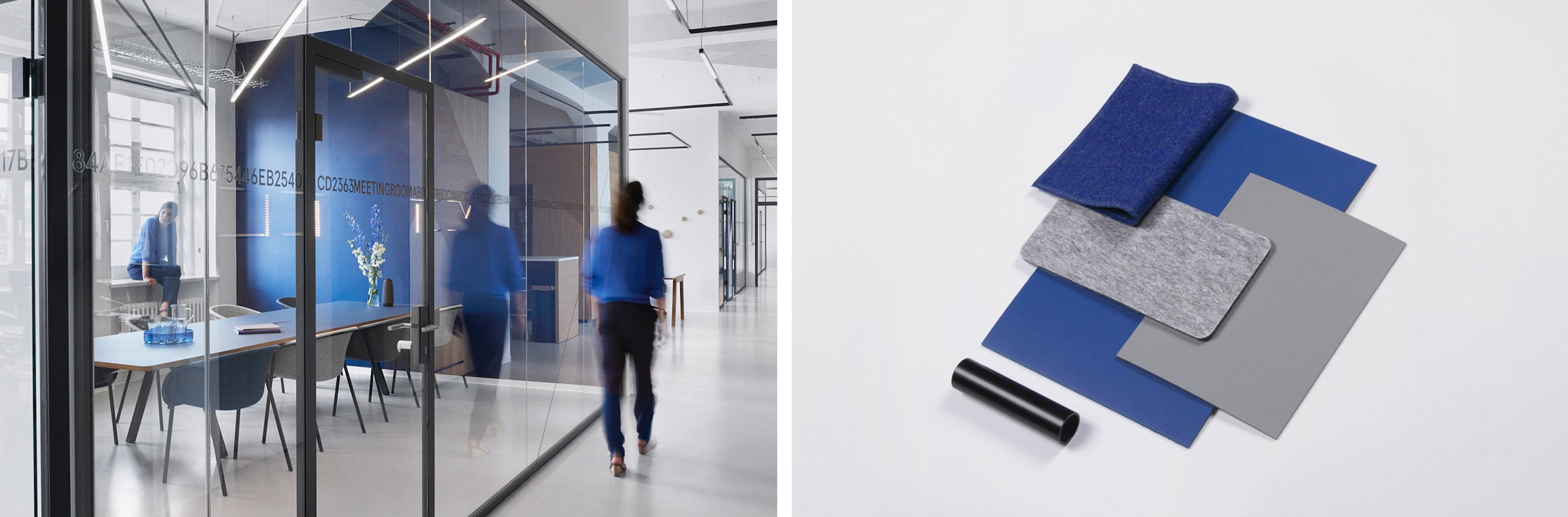
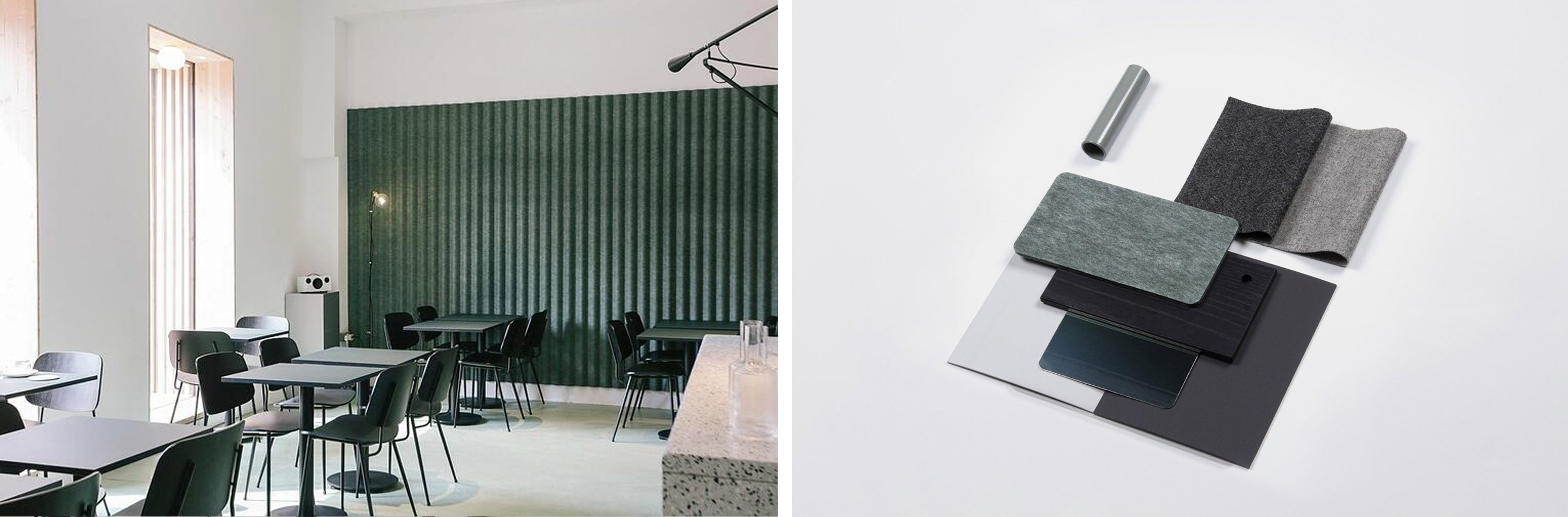
In terms of colour preferences, this saying could not be more relevant. However, if you are curious about the all-time favourites, here’s some data: putting together the findings of 16 cross-cultural studies, it appears that green and blue are mentioned as the most beloved colours across different countries, genders, and ages. They are also most commonly found in nature and belong to the cold group, known to have a calming and relaxing effect on people. With that in mind, green and blue can be a “safe” option for office design.
Insights
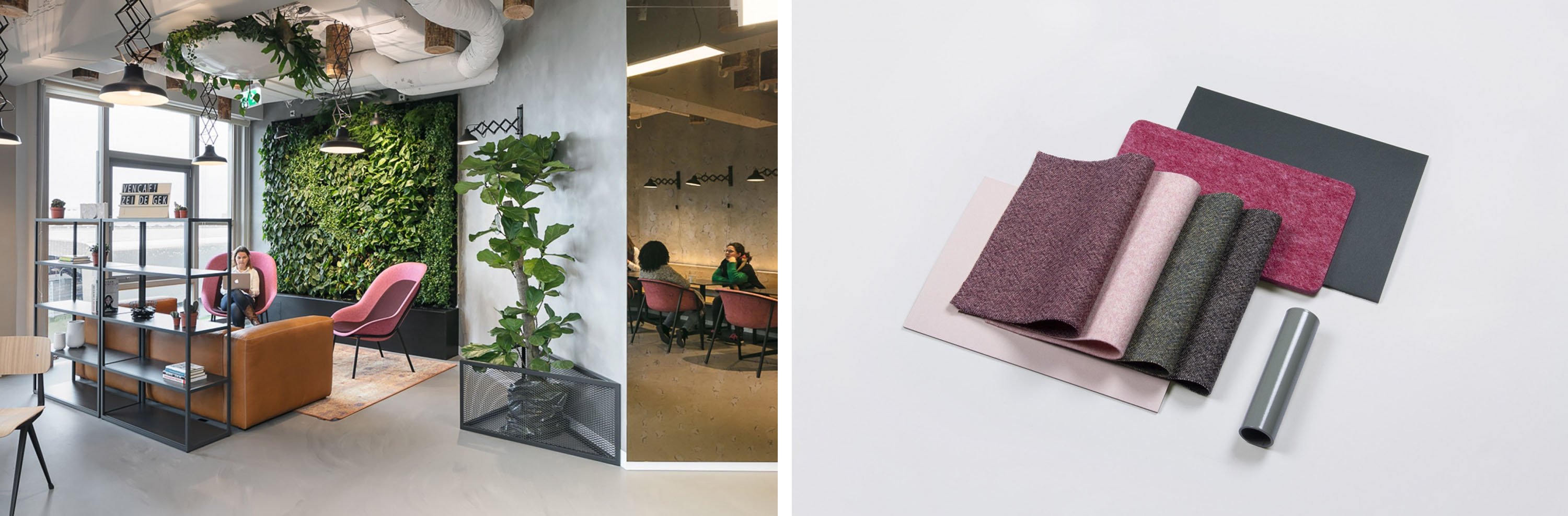
According to existing research, blue appears to be the dominating brand colour in many industries — from communications to pharmaceuticals. Whereas purple and orange are the last preferred. Possibly because they are rare in nature — making people feel that these colours are artificial.
Feeling blue red
Experimental studies on workplace design conducted by the University of Texas, found that even though people associate blue with depression (just as the saying goes)their feelings of sadness were actually higher in the predominantly red office than the blue or green ones. So, when you are depressed, you are probably feeling red.
Men are from Mars, women are from Venus and we also all feel differently about colours. Male workers reported higher rates of depression and anger in the brighter layout, and females felt this way about the lower saturated colour premises. An easy problem to solve if your team is homogeneous, but what if it’s not? Probably, a balance between the two extremes is a way out — plain base with bright accents would work here.
Colours and productivity
Which colours boost productivity? Most people note that they find white the least distracting, but is it really so? The data collected by the University of Texas showed a different pattern — people in white settings made more errors than those working in other surroundings. So, you might want to reconsider using too much white in a room for detail-oriented teams, like accounting. In fact, employees made the most mistakes in the light-coloured offices — such as beige, yellow, and light-grey, compared to darker environments.
Another factor to consider for detail-driven jobs is consistency — the change of visual scenery is said to lower the concentration and cause more faults. In this case, it is advisable to keep the same colour scheme throughout all working zones.
To date, there is no unanimous opinion as per the impact of colour on employee productivity, which is understandable. Working processes are so complex that it’s simply impossible to track whether a drop or increase in efficiency was caused by visual stimuli or other factors. However, there is a consensus that a colourful workplace tends to enhance performance more than a workplace with an achromatic scheme. For instance, a balance between cold and warm colours in the design shows a positive impact on team productivity.
So, does office colour matter?
Yes! But it’s not the only factor to consider when designing a workplace. Every office is a blend of different personalities and tastes, that have to be thoroughly studied to match the design with their needs. Colour is a primary instrument in this process, but not the only one. The level of its influence is not equally significant for everyone. People with high screening abilities are more affected by the visual stimuli, while low-screeners don’t consider colour setting to be that crucial.
If you are designing a new workplace, it would be interesting to keep Angela Wright’s research in mind. Define which personalities will be using the space and adjust your colour scheme accordingly. Creating a fit-for-all interior poses a challenge for employers and architects. The ultimate goal is a universal design with maximum flexibility, that can be tailored to individual preferences. Workplace aesthetics should not compromise its comfort — and colour choice is no exception here.


